Case Studies ©
Client
Core Alliance
Industry:
Healthcare - Spine & Orthopedic Medicine
Services:
Brand Strategy | Brand Identity
Agency & Role
Studio 3 | Brand Director (Strategy + Lead Design)
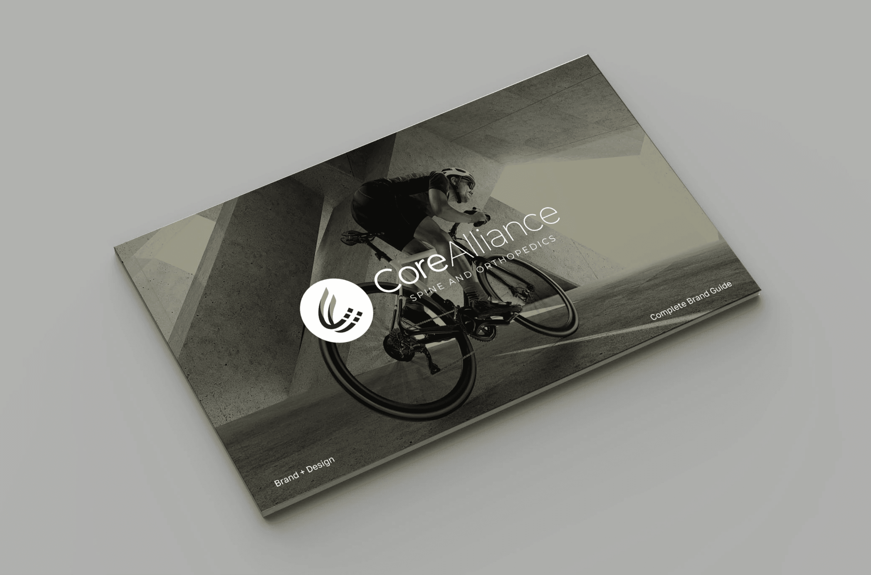
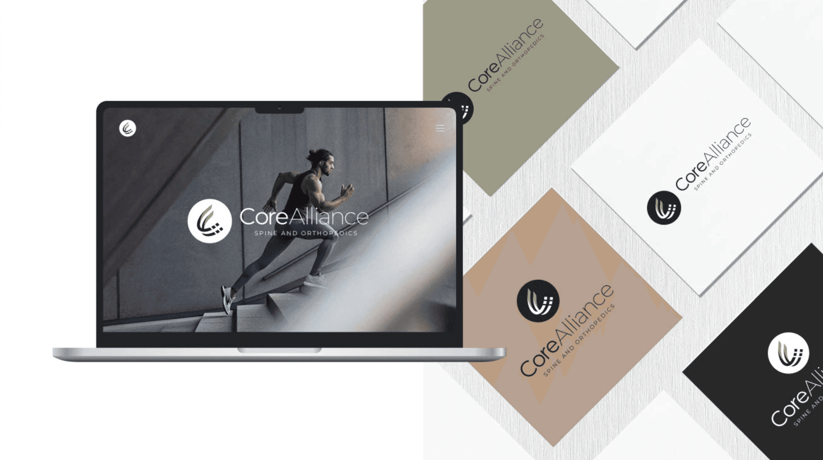
Created a strategy that repositioned Core Alliance around the new audience, placing the brand at the meeting point of expertise, aspiration, and personal connection. The result is a distinctive logomark paired with an earthy, grounded palette and a photography direction built around real movement, cyclists, runners, everyday athletes in motion rather than clinical stock imagery. That system carries through a complete brand guide and into digital touchpoints like the website, giving Core Alliance a look that feels credible and expert while still speaking to the active, performance-minded patients it now set out to reach.
Outcome
Core Alliance, a spine and orthopedics practice, needed more than a logo. They wanted to shift their audience toward active, performance-minded patients, athletes and everyday movers, rather than the older, more clinical demographic the specialty is usually associated with, so we started with brand strategy before any design work began. The identity needed to soften a clinical, sometimes intimidating specialty into something approachable, while still feeling credible to people who saw themselves as active, not sidelined. Core Alliance was also planning to grow, adding services and expanding into new states, so the brand needed room to scale without losing its personal touch.
Challenge


Client
Weber Facial Plastic Surgery
Industry:
Healthcare - Cosmetic Surgery
Services:
Brand Identity
Agency & Role
Studio 3 | Brand Director (Strategy + Lead Design)
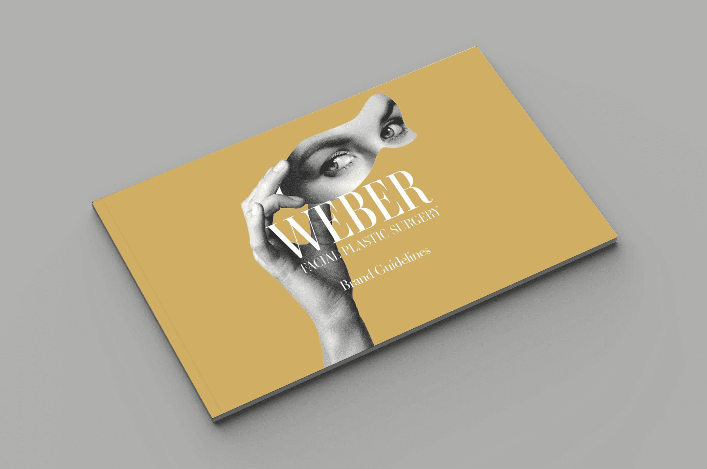
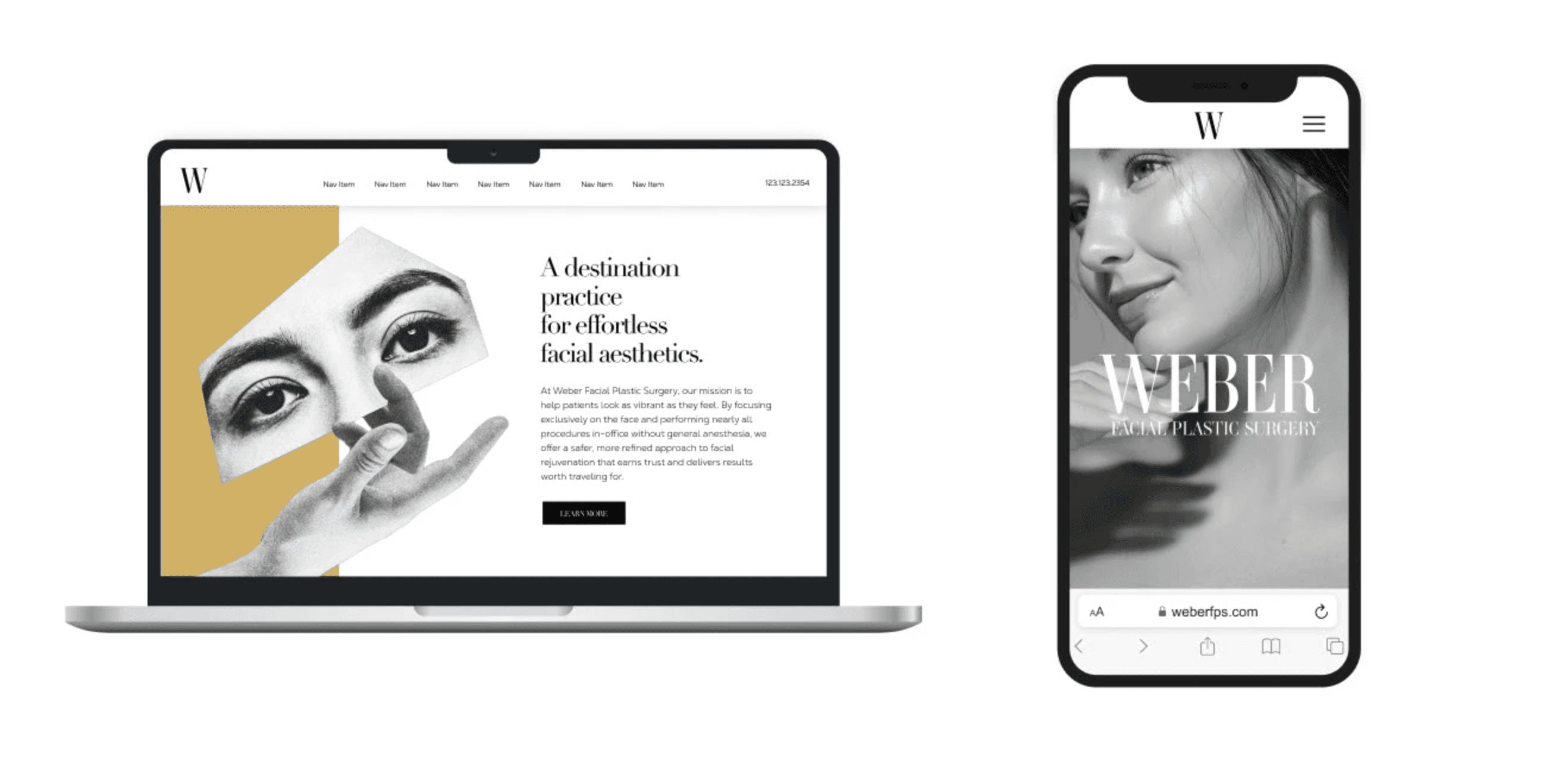
The result is a refined identity built around a bold serif wordmark, a rich mustard and black palette, and striking black and white portrait photography with a fragmented, collage-like treatment. That fine art sensibility carries through the brand guidelines, business collateral, and digital presence, including the website and mobile experience, giving Weber a brand that is modern, authoritative, and unmistakably high-end.
Outcome
Weber Facial Plastic Surgery came to the table needing a visual identity overhaul, not a refresh. The existing look no longer reflected the level of expertise and exclusivity the practice wanted to be known for. As a boutique, face-focused practice, Weber needed a brand that felt luxury and elevated, something that could stand apart from typical medical or clinical branding and speak directly to a more discerning, aesthetics-focused clientele.
Challenge


Client
National Pediatric Center
Industry:
Healthcare - Pediatric
Services:
Brand Identity
Agency & Role
Studio 3 | Brand Director (Strategy + Lead Design)
The result is a playful, colorful identity anchored by a friendly smiley-face icon system and a bright, rounded logomark. Warm oranges, teals, and yellows replace clinical sterility, paired with candid photography of children and caregivers in real moments of care. Loose, hand-drawn line work ties everything together across the brand guide, social presence, and website, giving National Pediatric Center a brand that that is compassionate, bilingual, and rooted in community trust, exactly as they describe themselves.
Outcome
National Pediatric Center came to the table with a strong sense of who they were, a pediatric healthcare center with a nonprofit heart, built on holistic care and deep community involvement. What they lacked was a visual identity to match. Their existing brand was essentially nonexistent, leaving a gap between the warmth and trust they'd built in the community and how that showed up visually. They needed a complete identity revamp that could carry both the credibility of a healthcare provider and the approachability of an organization built around kids and families.
Challenge


Client
REI Plastic Surgery
Industry:
Healthcare - Cosmetic Aesthetics
Services:
Brand Strategy | Brand Identity
Agency & Role
Studio 3 | Brand Director (Strategy + Design Lead)
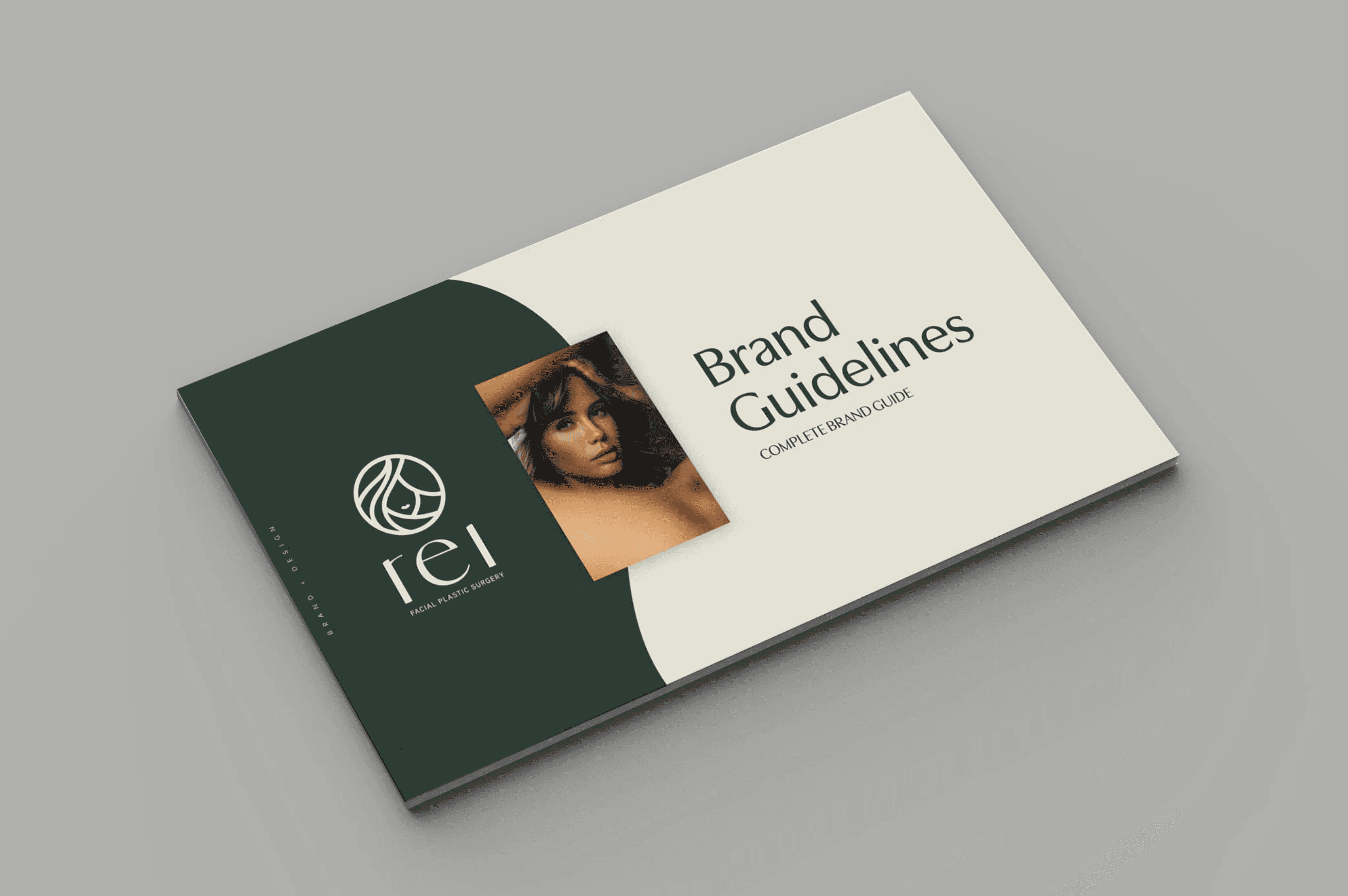
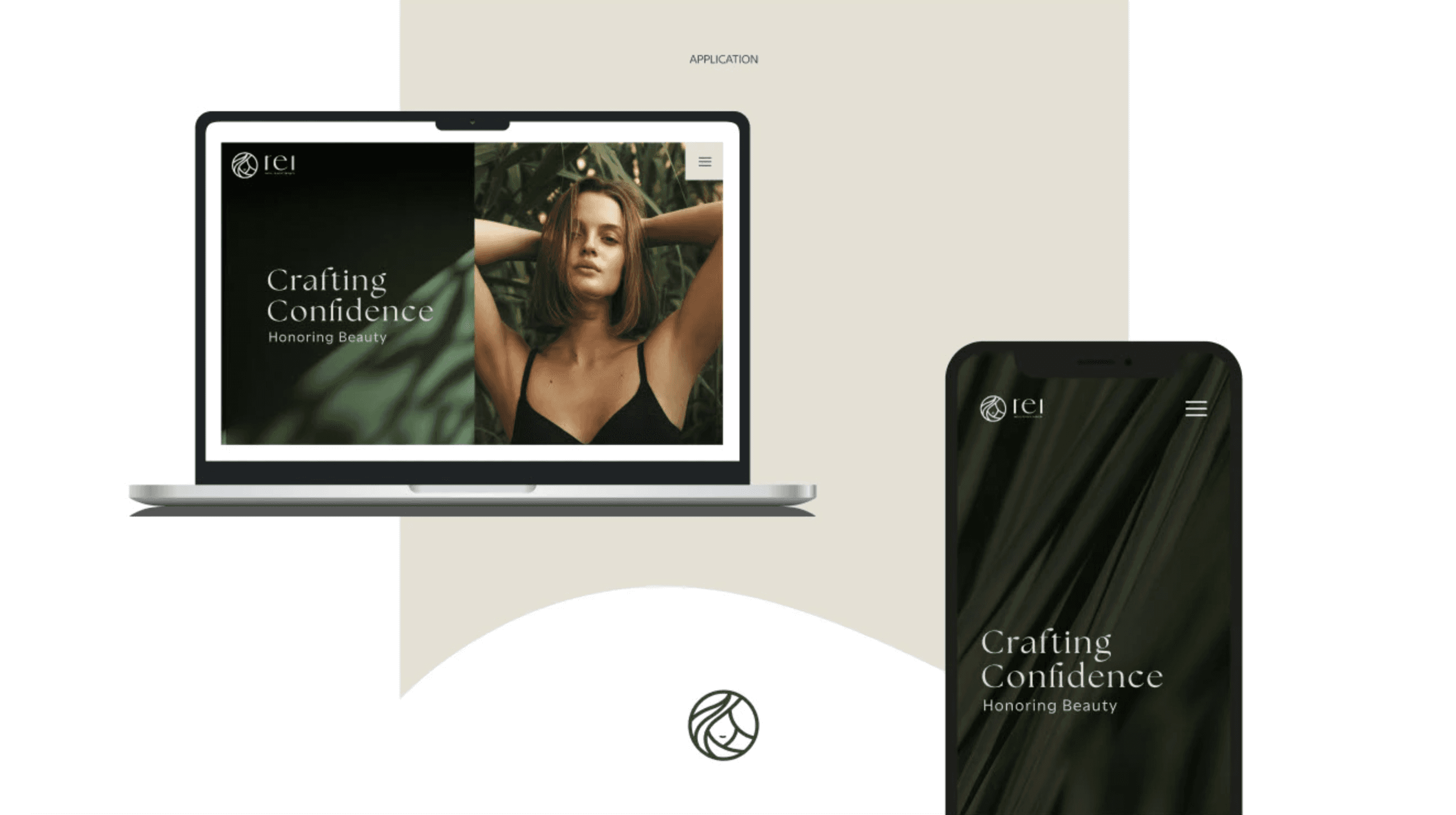
The result is a full brand strategy and identity built around honoring beauty and crafting confidence rather than overt transformation. Visually, it comes through in a calming, nature-inspired logomark and a deep green and cream palette that feels grounded and elegant rather than sterile. Soft, editorial photography paired with organic shapes and gentle typography carries the strategy through the brand guide, website, and digital touchpoints, creating a warm, culturally resonant presence that positions REI as refined, personal, and rooted in place.
Outcome
REI Facial Plastic Surgery, a Hawai'i-based practice, wanted more than a logo, they needed a brand strategy and identity built from the ground up. The challenge was rooting the brand in the natural beauty and cultural identity of Hawai'i itself, creating something warm and personal rather than clinical or transformation-driven. The strategy needed to balance authentic connection to the local community with enough refinement and trust to appeal to a diverse range of patients seeking subtle, natural-looking results, all translated into a visual identity that could carry that positioning across every touchpoint.
Challenge


Client
Statür Skin
Industry
Healthcare - Cosmetics
Services
Brand Strategy | Brand Identity
Agency & Role
Studio 3 | Brand Director (Strategy + Lead Design)
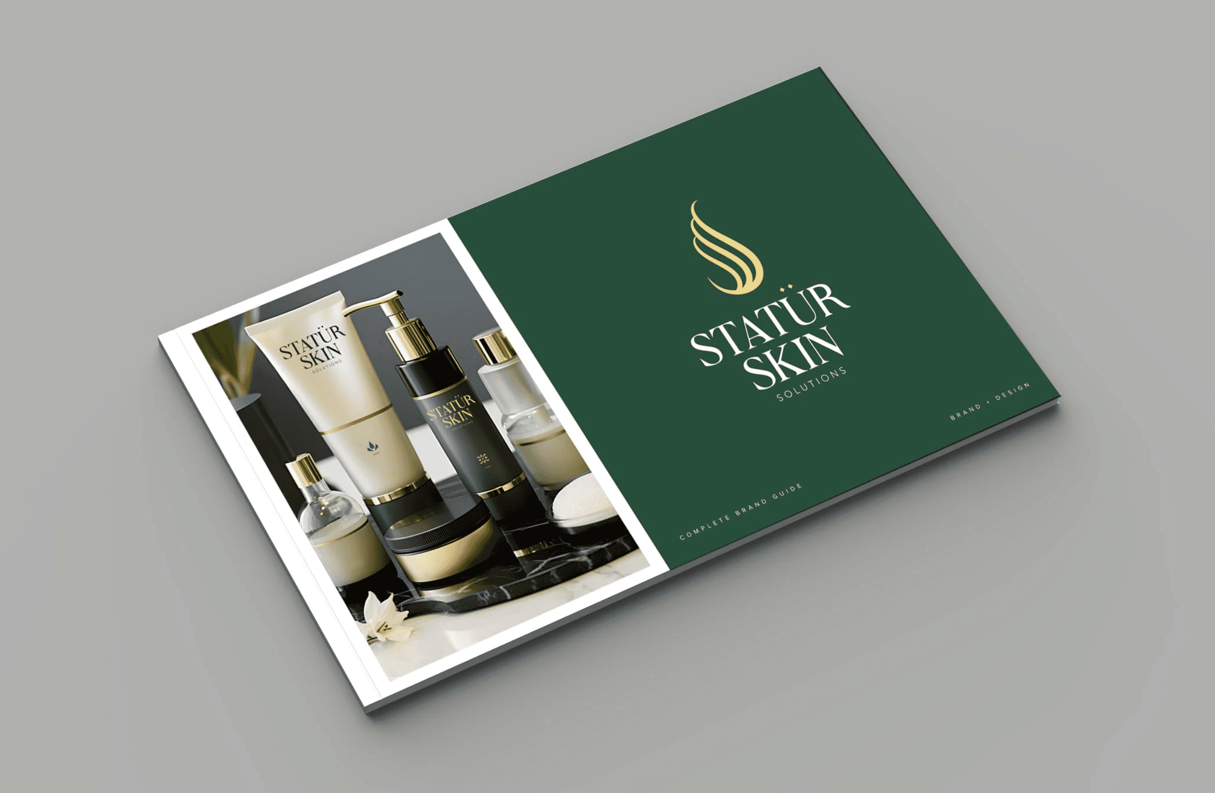
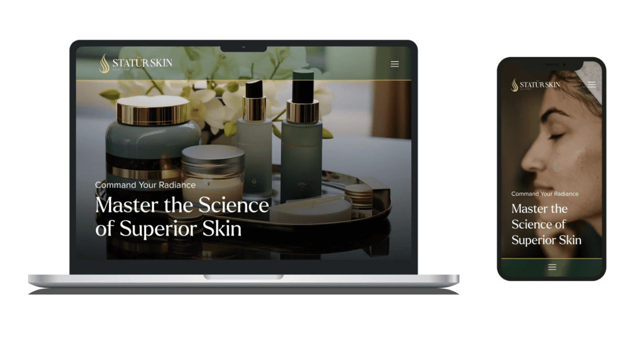
The result is a refined, luxury identity anchored by a gold flame-like emblem and a deep green and gold palette that feels premium and commanding. A custom icon set marks each product line, from Women's and Men's to Primary, Supplement, and Body Care, giving the system a cohesive, elevated visual language across packaging. That same sense of simplicity and class carries through the brand guide, product photography, and website, positioning Statür Skin around the idea of mastering the science of superior skin.
Outcome
Statür Skin came to the table as a brand-new company with nothing built yet, no strategy, no identity, no visual language. As a skincare line, they wanted a brand strategy and visual identity that would reinforce core values of leadership, influence, and luxury from day one. The challenge was creating a full brand foundation that emphasized simplicity, elegance, and class, including a custom icon set to distinguish their product lines, all built from scratch rather than refined from something existing.
Challenge


Client
Core Alliance
Industry:
Healthcare - Spine & Orthopedic Medicine
Services:
Brand Strategy | Brand Identity
Agency & Role
Studio 3 | Brand Director (Strategy + Lead Design)
2020
Created a strategy that repositioned Core Alliance around the new audience, placing the brand at the meeting point of expertise, aspiration, and personal connection. The result is a distinctive logomark paired with an earthy, grounded palette and a photography direction built around real movement, cyclists, runners, everyday athletes in motion rather than clinical stock imagery. That system carries through a complete brand guide and into digital touchpoints like the website, giving Core Alliance a look that feels credible and expert while still speaking to the active, performance-minded patients it now set out to reach.
Outcome
Core Alliance, a spine and orthopedics practice, needed more than a logo. They wanted to shift their audience toward active, performance-minded patients, athletes and everyday movers, rather than the older, more clinical demographic the specialty is usually associated with, so we started with brand strategy before any design work began. The identity needed to soften a clinical, sometimes intimidating specialty into something approachable, while still feeling credible to people who saw themselves as active, not sidelined. Core Alliance was also planning to grow, adding services and expanding into new states, so the brand needed room to scale without losing its personal touch.
Challenge
Client
Weber Plastic Surgery
Industry:
Healthcare - Cosmetic Surgery
Services:
Brand Identity
Agency & Role
Studio 3 | Brand Director (Strategy + Lead Design)
2025
The result is a refined identity built around a bold serif wordmark, a rich mustard and black palette, and striking black and white portrait photography with a fragmented, collage-like treatment. That fine art sensibility carries through the brand guidelines, business collateral, and digital presence, including the website and mobile experience, giving Weber a brand that is modern, authoritative, and unmistakably high-end.
Outcome
Weber Facial Plastic Surgery came to the table needing a visual identity overhaul, not a refresh. The existing look no longer reflected the level of expertise and exclusivity the practice wanted to be known for. As a boutique, face-focused practice, Weber needed a brand that felt luxury and elevated, something that could stand apart from typical medical or clinical branding and speak directly to a more discerning, aesthetics-focused clientele.
Challenge
Client
National Pediatric Center
Industry:
Healthcare - Pediatric
Services:
Brand Identity
Agency & Role
Studio 3 | Brand Director (Strategy + Lead Design)
2026
The result is a playful, colorful identity anchored by a friendly smiley-face icon system and a bright, rounded logomark. Warm oranges, teals, and yellows replace clinical sterility, paired with candid photography of children and caregivers in real moments of care. Loose, hand-drawn line work ties everything together across the brand guide, social presence, and website, giving National Pediatric Center a brand that is compassionate, bilingual, and rooted in community trust, exactly as they describe themselves.
Outcome
National Pediatric Center came to the table with a strong sense of who they were, a pediatric healthcare center with a nonprofit heart, built on holistic care and deep community involvement. What they lacked was a visual identity to match. Their existing brand was essentially nonexistent, leaving a gap between the warmth and trust they'd built in the community and how that showed up visually. They needed a complete identity revamp that could carry both the credibility of a healthcare provider and the approachability of an organization built around kids and families.
Challenge
Client
REI Plastic Surgery
Industry:
Healthcare - Cosmetic Aesthetics
Services:
Brand Strategy | Brand Identity
Agency & Role
Studio 3 | Brand Director (Strategy + Design Lead)
2024
The result is a full brand strategy and identity built around honoring beauty and crafting confidence rather than overt transformation. Visually, it comes through in a calming, nature-inspired logomark and a deep green and cream palette that feels grounded and elegant rather than sterile. Soft, editorial photography paired with organic shapes and gentle typography carries the strategy through the brand guide, website, and digital touchpoints, creating a warm, culturally resonant presence that positions REI as refined, personal, and rooted in place.
Outcome
REI Facial Plastic Surgery, a Hawai'i-based practice, wanted more than a logo, they needed a brand strategy and identity built from the ground up. The challenge was rooting the brand in the natural beauty and cultural identity of Hawai'i itself, creating something warm and personal rather than clinical or transformation-driven. The strategy needed to balance authentic connection to the local community with enough refinement and trust to appeal to a diverse range of patients seeking subtle, natural-looking results, all translated into a visual identity that could carry that positioning across every touchpoint.
Challenge
Client
Statür Skin
Industry
Healthcare - Cosmetics
Services
Brand Strategy | Brand Identity
Agency & Role
Studio 3 | Brand Director (Strategy + Lead Design)
2024
The result is a refined, luxury identity anchored by a gold flame-like emblem and a deep green and gold palette that feels premium and commanding. A custom icon set marks each product line, from Women's and Men's to Primary, Supplement, and Body Care, giving the system a cohesive, elevated visual language across packaging. That same sense of simplicity and class carries through the brand guide, product photography, and website, positioning Statür Skin around the idea of mastering the science of superior skin.
Outcome
Statür Skin came to the table as a brand-new company with nothing built yet, no strategy, no identity, no visual language. As a skincare line, they wanted a brand strategy and visual identity that would reinforce core values of leadership, influence, and luxury from day one. The challenge was creating a full brand foundation that emphasized simplicity, elegance, and class, including a custom icon set to distinguish their product lines, all built from scratch rather than refined from something existing.
Challenge
Strategy + Creative +